
Most libraries approach refurbishing with the wrong mindset. They spend a tonne of time deciding on shelving. It feels like a big decision — and it is — but it shouldn’t be the first thing you think about.
Shelving alone doesn’t shape your library. It’s how open the room feels, how every collection is grouped, and how easily readers find their way around. Libraries need to be strategic with placement, wayfinding, and display. Only when these are determined should you start specifying the right shelving.
Good libraries are planned the same way good shops are planned. They are shaped around browsing, sightlines and flow. Library shelving, ultimately, enriches your patrons’ experience in finding, discovering, and reading books.
In this practical guide, we’ll cover everything you need to know about choosing library shelving for your floor plan.
And that starts with…
1. Planning the space before the shelving
There are a handful of principles driving library design — and it’s not strictly about shelving.
The first is open space. Libraries have moved away from tall, packed stacks. The floor needs room to breathe and room to change so it can hold a class one hour and quiet reading the next.
The second is sightlines. You want your staff to have visibility across the whole room. It helps them keep an eye on things. In addition, it makes the space feel welcoming rather than closed in.
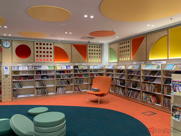
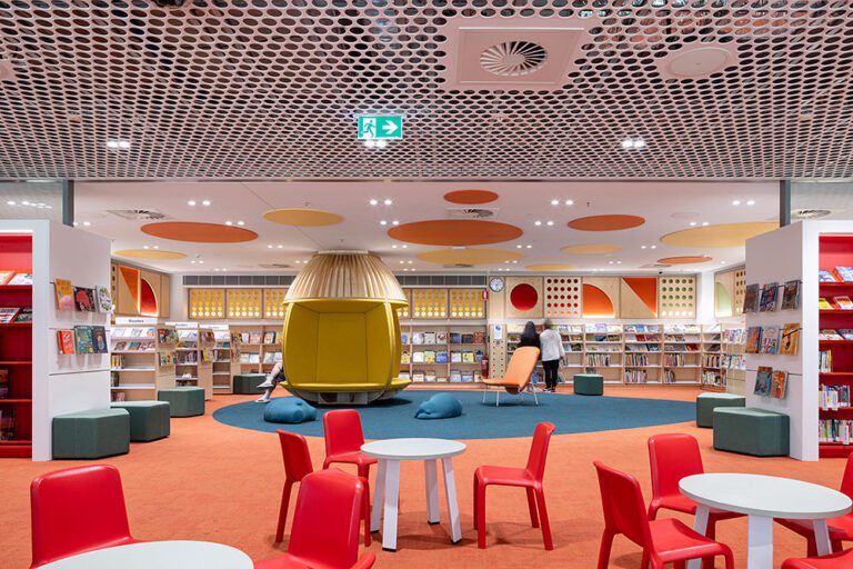
The third is browsability. More libraries now group books by genre, the same way that a bookshop does, instead of holding strictly to Dewey or the alphabet. It matches how people actually look for something to read.
The fourth is simple. The books are your design’s heroes. Shelving comes in neutral colours, letting the covers do the talking. Shelving that shouts over the collection works against you.
Library design consultant Kevin Hennah has spent a long time making the case for this approach with Australian libraries, drawing on his years in retail visual merchandising. Get these four right, and the rest will follow.
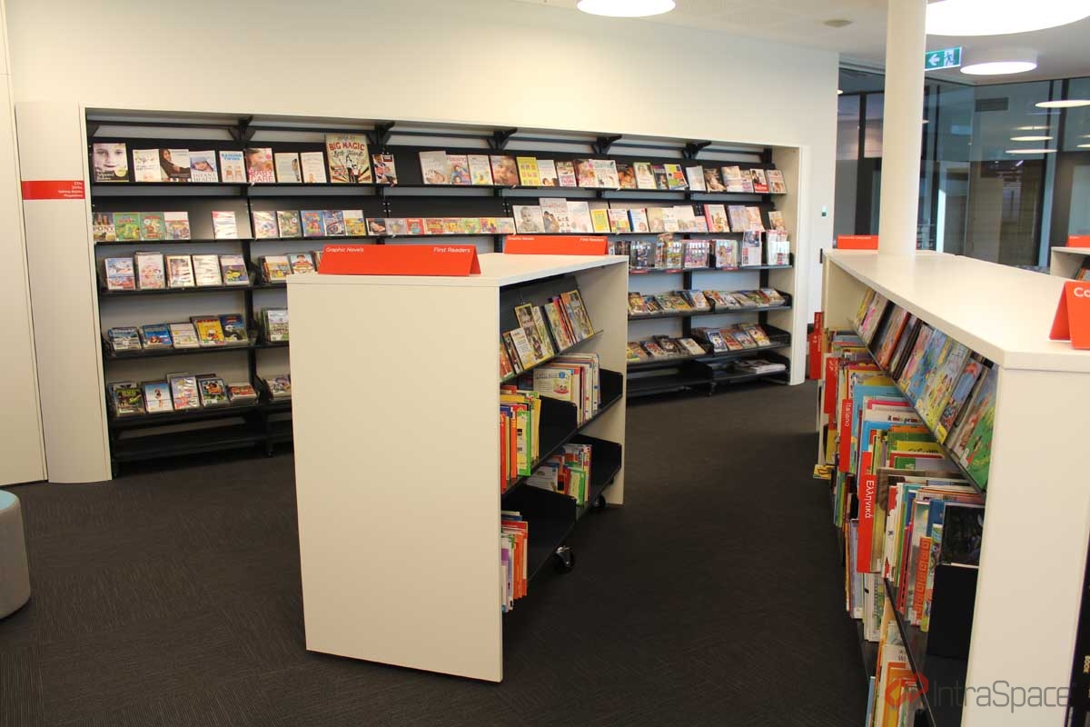
2. Keeping the middle low so staff can see across
Central shelving should stay low. Around 1240mm to 1640mm is the usual range.
At that height, a librarian can stand anywhere and take in the whole floor. That matters for supervision in school and youth spaces, and it keeps the room feeling open.
Taller storage belongs around the edges, where a wall supports it and it doesn’t block any view. This is also a practical use for single-sided convertible library shelving, which you can raise or lower as the layout changes without buying new infrastructure.
3. Grouping titles by genre, then let the shelving make the zones
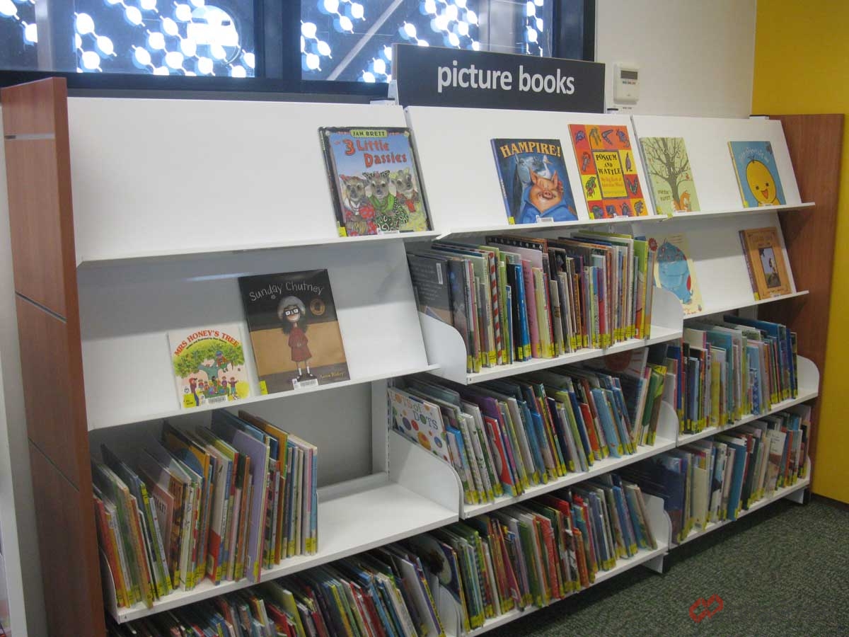
Genrefication only works if the floor backs it up. Grouping books into categories like young adult fiction, graphic novels or nonfiction turns a collection into something a reader can browse on instinct. But this type of grouping counts on clear zones and clean edges between them.
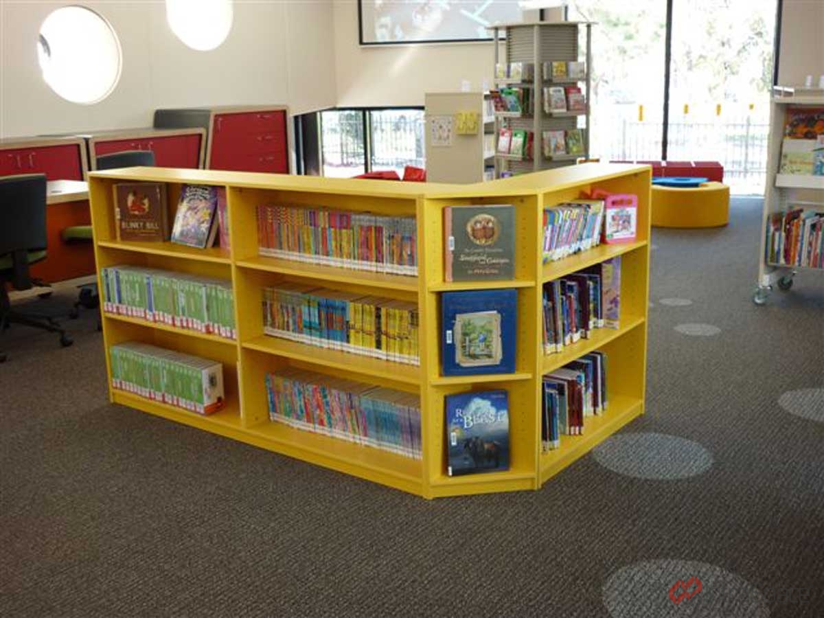
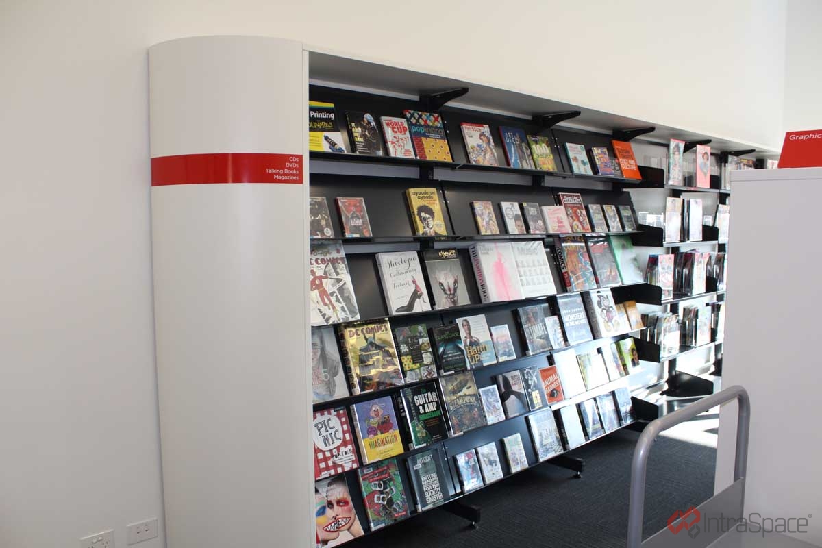
Double-sided bays do that work well. Each run separates one category from the next, and the end panels mark the boundary. Those end panels are the hardest-working signage surface in the building. Category headers, bay labels and slatwall slots for small displays all live in these panels, with no extra furniture needed.
The payoff can be real. In Softlink’s 2017 School Library Survey, one school that refurbished and reorganised its library reported fiction loans and recreational visits were up by at least 300 per cent.
4. Making signage and shelving work as one system
A genrefied collection is only as good as its wayfinding.
Low central runs open up sight corridors so overhead and hanging signage reads clearly from across the room. End panels carry category and direction signage at eye level, right where people look for it.
Strong shelving with weak signage is harder to use than a plain room with clear signs. Plan the two together to ensure that they work in tandem.
5. Putting the books on show
Spine-out shelving has been standard for most libraries. It’s ideal for storing your collections, but face-out display enriches browsing, be it for new titles, themed picks or staff recommendations — and those are the books that see uplift in borrow rates.
A few additions sit happily alongside any layout. Angled display shelves fit to existing bays and turn new releases cover out. Zig Zag shelves work at the ends of aisles and in children’s areas. Book Tub Shelving suits picture books and early readers near the low perimeter units. Aim for a curated front row rather than displays on every surface.
Now we can specify: Single-sided or double-sided?
Once the space, the sightlines, the zones and the display are all settled, we can start specifying for the best shelving configuration.
Single-sided shelving has shelves on one face. It sits against a wall, frees up the centre of the room and can run taller, up to around 2000mm, because the wall carries it.
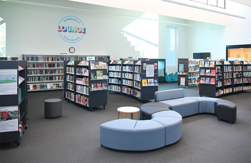
Double-sided shelving has shelves on both faces. It runs as freestanding aisles, holds far more per square metre and builds the category zones that genrefication needs. Kept between 1240mm and 1640mm, it holds the sightlines too.
Most libraries use both. And because the range is convertible, with double-sided mobile convertible shelving and double-bay double-sided mobile shelving available on castors, you can wheel a run aside to clear the floor for an event and roll it back the next morning.
Match your shelving to your floor plan
Three rooms come up again and again.
A long narrow room works best with single-sided units along both long walls and a thin spine of low, double-sided units or display furniture down the centre. A full aisle through a narrow room chokes the flow.
A square or wide-open room suits low double-sided aisles through the middle, framed by single-sided ones around the edges. You get the capacity, the zones and the open feel together.
A room that doubles as a classroom or event space warrants mobile double-sided units. The collection stays put day to day, and the floor clears in minutes when you need it.
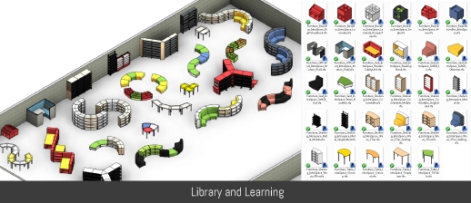
Whatever you choose, plan the aisle width. AS 1428.1:2021 sets 1000mm as the minimum clear width for a continuous accessible path of travel, and many designers allow more between stacks where wheelchairs, walkers and trolleys are part of daily life. For permanent high-density storage, metal library shelving is the sturdier spec. Architects and specifiers can pull BIM and Revit models for IntraSpace shelving straight into the room layout before documentation goes out.
Quick decision map to guide your spec
| If your priority is… | Consider… |
| An open, welcoming floor | Low central shelving with perimeter storage |
| Sightlines and supervision | Cental double-sided kept to 1,240–1,640 mm. |
| Browsability and genrefication | Zoned double-sided bays with end-panel signage |
| Showing off new and featured titles | Angled display, Zig Zag and book tub shelving |
| Wall space but limited floor area | Single-sided perimeter shelving |
| A high-volume collection | Double-sided central aisles |
| A multi-use or event space | Mobile, double-sided on castors |
| Room to grow | Convertible options, single or double |
| Permanent high-density storage | Metal library shelving |
Talk to us before you specify
Not sure how to plan your floor? Have a word with our team first.
We will look at your space, your collection and how you want people to use the room, then handle the practical side too: space planning, BIM-ready specifications, removal of the old shelving, stock relocation and an install scheduled around your opening hours.